





The Challenge
We started by interviewing 12 employees across Zurich and London and reviewing six months of support requests. One relationship manager summed it up: “I know it’s in there somewhere — I just never have time to find it.” Every tool carried the same weight, so the ones people needed most were the hardest to reach. Reporting a broken laptop took six steps. At Admind, a team of three designers took this on under a product manager, for a bank where security and brand consistency come first.

All eight tools, or the ones that matter?
Constraint: UBS stakeholders wanted all eight tools on the home screen. Each tool had an internal owner, and nobody wanted theirs one tap further away.
Two hypotheses: Theirs: if everything is visible, nothing gets lost. Ours: when everything carries the same weight, people slow down, and the tools they use daily get buried among the ones they open once a quarter.
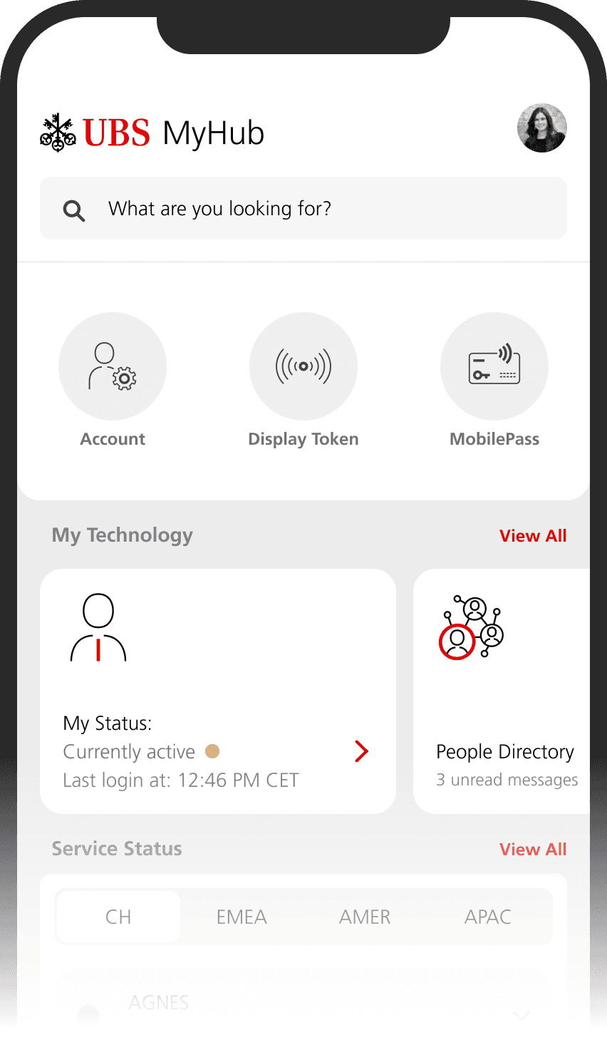
Experiment: Rather than argue it out in a meeting, we built both and let Optimizely decide. Both home screens shipped behind a feature flag, and Optimizely split employees 50/50 between the eight-tile grid and the lean layout for two weeks. The primary metric was time from opening the app to the first tap on a tool; we also tracked search use and taps on the tools behind View All.
Evidence: The lean layout got people to their tool 9% faster, and the tools behind View All kept their usage, mostly reached through search.
Decision: Stakeholders signed off on the lean home screen. What made it land was the compromise: every tool stays one tap away, and search covers all of them.
The Outcome
In usability testing with 10 employees across 5 core tasks, participants performed 11.5% better in the new app. Submitting a support ticket dropped from 6 steps to 3, meeting setup got 16% faster with scheduling built into the People Directory, and Service Status moved onto the home screen, so outages are visible at a glance. After filing a ticket in under a minute, one tester just looked up and asked: “Wait, that’s it?”
The Takeaway
By focusing on usability, security and communication, we turned UBS My Hub into a clearer, more connected workplace tool. The key lesson: in an enterprise app, deciding what comes first matters as much as what gets added — a clear hierarchy for the most-used tools is what made everyday tasks faster. Internal apps deserve the same user-centered care as customer-facing ones. Want to talk about this project or a UX collaboration? Feel free to reach out.