GLYPHS 3

Enhancing Usability for Type Designers

UX/UI Design

Design System

Mobile & Web

B2B Saas

Field Operations

GLYPHS 3

Enhancing Usability for Type Designers

UX/UI Design

Design System

Mobile & Web

B2B Saas

Field Operations

GLYPHS 3

Enhancing Usability for Type Designers

  • UX/UI Design

  • Design System

  • Mobile & Web

  • B2B SaaS

  • Field Operations

Product
Problem
Hard-to-Find Resources

Glyphs is a font design tool for Mac used by beginner and professional type designers. With the launch of Glyphs 3, its website had to keep up: tools, tutorials, and community content were hard to discover, and the digital presence needed to better support learning and engagement.

My role
UX/UI Designer

I worked on the Glyphs website redesign in close collaboration with creative director Matteo Bologna and designer Andrea Trabucco-Campos — covering information architecture, the Learn section, UI design, and product visuals.

Solution
A Learning-First Website

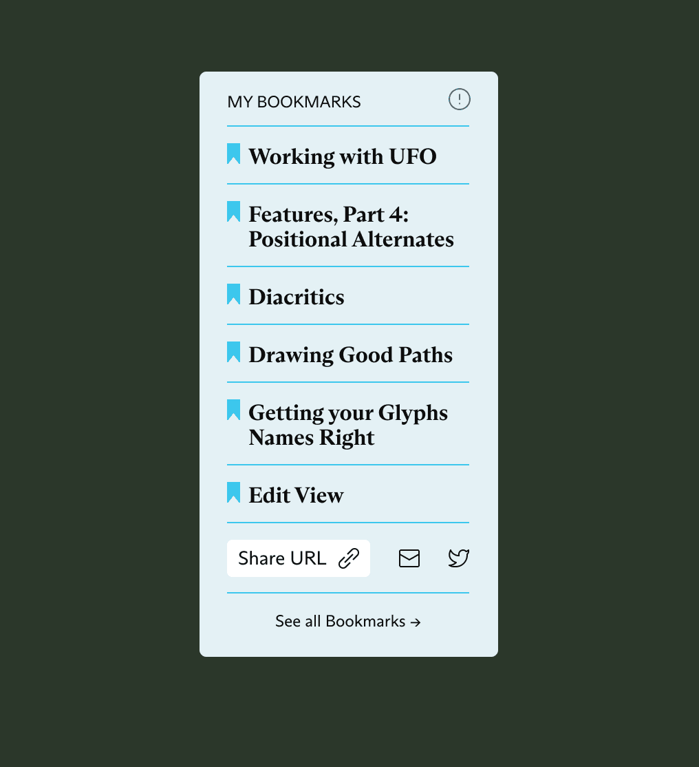
I restructured the site architecture around clear user journeys, rebuilt the Learn section with bookmarking and curated expert learning paths, and created a clean, modular UI typeset in ABC Arizona Variable with an evolved Glyphs green palette.

Result
Faster, More Engaging

Task completion became 38% faster, 60% of users now discover new features through the Learn section, bounce rate dropped by 42%, and accessibility scores improved by 25%.

Impact
38%

Faster task completion

Improved navigation and content architecture
60%

Discover features via Learn

Bookmarking and curated learning paths
-42%

Lower bounce rate

Clearer homepage structure and calls to action
Product
Problem
Hard-to-Find Resources

Glyphs is a font design tool for Mac used by beginner and professional type designers. With the launch of Glyphs 3, its website had to keep up: tools, tutorials, and community content were hard to discover, and the digital presence needed to better support learning and engagement.

My role
UX/UI Designer

I worked on the Glyphs website redesign in close collaboration with creative director Matteo Bologna and designer Andrea Trabucco-Campos — covering information architecture, the Learn section, UI design, and product visuals.

Solution
A Learning-First Website

I restructured the site architecture around clear user journeys, rebuilt the Learn section with bookmarking and curated expert learning paths, and created a clean, modular UI typeset in ABC Arizona Variable with an evolved Glyphs green palette.

Result
Faster, More Engaging

Task completion became 38% faster, 60% of users now discover new features through the Learn section, bounce rate dropped by 42%, and accessibility scores improved by 25%.

Impact
38%

Faster task completion

Improved navigation and content architecture
60%

Discover features via Learn

Bookmarking and curated learning paths
-42%

Lower bounce rate

Clearer homepage structure and calls to action
Product
Problem
Hard-to-Find Resources

Glyphs is a font design tool for Mac used by beginner and professional type designers. With the launch of Glyphs 3, its website had to keep up: tools, tutorials, and community content were hard to discover, and the digital presence needed to better support learning and engagement.

My role
UX/UI Designer

I worked on the Glyphs website redesign in close collaboration with creative director Matteo Bologna and designer Andrea Trabucco-Campos — covering information architecture, the Learn section, UI design, and product visuals.

Solution
A Learning-First Website

I restructured the site architecture around clear user journeys, rebuilt the Learn section with bookmarking and curated expert learning paths, and created a clean, modular UI typeset in ABC Arizona Variable with an evolved Glyphs green palette.

Result
Faster, More Engaging

Task completion became 38% faster, 60% of users now discover new features through the Learn section, bounce rate dropped by 42%, and accessibility scores improved by 25%.

Impact
38%

Faster task completion

Improved navigation and content architecture
60%

Discover features via Learn

Bookmarking and curated learning paths
-42%

Lower bounce rate

Clearer homepage structure and calls to action

Approach

The redesigned website prioritizes a seamless user experience, making navigation intuitive and resources more accessible. The architecture has been restructured to streamline user journeys, ensuring that designers—whether beginners or professionals—can quickly find the tools, tutorials, and community support they need.

At the core of the experience is a focus on education and engagement. A newly structured "Learn" section integrates bookmarking features, allowing users to save and organize tutorials. Expert recommendations provide curated learning paths, covering everything from foundational principles to advanced font coding techniques.

Design & Typography

42%

reduction in bounce rate by enhancing the homepage structure and clarifying call-to-actions.

25%

74

improvement in accessibility scores by optimizing contrast, typography, and interactive elements.

To maintain visual coherence and reinforce the brand’s identity, the website is entirely typeset in ABC Arizona, a custom Variable font developed within Glyphs. Its dynamic nature allows for flexible typography—seamlessly adjusting for readability, hierarchy, and emphasis across different content blocks.

The design system embraces a clean, modular aesthetic, ensuring that the interface remains secondary to the content it presents. A refreshed color palette evolves Glyphs’ signature green, introducing a spectrum of tones that add energy while maintaining a sense of brand continuity.


Interfaces

The redesigned Glyphs website was driven by a focus on delivering a seamless user experience for both novice and professional type designers. By simplifying the site's structure and improving its visual hierarchy, the new interface allows users to intuitively navigate through key resources, tutorials, and community content.

Key UX improvements include a streamlined layout with easily identifiable navigation paths and enhanced interactive elements. The Learn section was reimagined to offer personalized learning experiences through bookmarking and curated content. This not only helps users find tutorials faster but also allows them to engage with specific topics, such as font creation techniques or coding tips.

The UI design ensures consistency across all pages, with an emphasis on clarity and readability. The choice of typography—using the ABC Arizona Variable Font—enhances the experience by offering versatility while maintaining a polished, unified aesthetic. Interactive components like buttons and drop-down menus are optimized for efficiency and accessibility, ensuring a smooth flow from one section to the next.

By focusing on user-centric design principles, the project enhanced the usability of the website, increasing engagement and fostering a more dynamic connection between users and the broader type design community.

Visualizing the Product

Beyond static design elements, the project involved creating abstracted representations of the Glyphs environment—used in animations and motion graphics to illustrate key features dynamically. This approach not only makes the interface feel more approachable but also reinforces the app’s role as a creative tool for expression.

The updated identity extends across Glyphs 3 Mini and Pro tools, ensuring a consistent experience across the entire suite. The new visual language is designed to scale, maintaining clarity and functionality across the website, software UI, and promotional materials.

By centering the design around user needs and community engagement, the new Glyphs experience not only highlights the app’s capabilities but also strengthens its role as an essential resource for type designers worldwide.

Let's talk!

Looking for a UX/UI designer to bring your vision to life?
Let’s connect and build something great together. Contact me at:

nicholas.sliwinski@gmail.com

Copied

*

Would you like me to get back at you? Just tell me your needs and I'll answer asap.

© 2026 NERO

Let's talk!

Looking for a UX/UI designer to bring your vision to life? Let’s connect and build something great together. Contact me at:

nicholas.sliwinski@gmail.com

Copied

*

Would you like me to get back at you? Just tell me your needs and I'll answer asap.

© 2026 NERO

Let's talk!

Looking for a UX/UI designer to bring your vision to life? Let’s connect and build something great together. Contact me at:

nicholas.sliwinski@gmail.com

Copied

*

Would you like me to get back at you? Just tell me your needs and I'll answer asap.

© 2026 NERO