


Context: an inbox with opinions
Spark had a clear point of view long before AI: less work to manage email. Quick Actions (⌘K) put snooze, delegate and send-later behind one command, Done archives a whole thread in one tap, and a unified inbox runs several accounts at once. Any AI we added had to keep that promise, not compete with it.
Where should AI live?
Our first AI prototype was a chat panel docked beside the inbox. In internal testing it looked impressive and got used once: people asked it a question, then went back to their email. That flop gave us the question behind every decision that followed: where should AI live? We settled on three rules. Embed AI when it improves something people already do, like writing a reply. Give it its own place only when the job is open-ended, like finding what needs attention across the inbox. And release it as a preview when a wrong answer costs more than a bad draft, like meeting notes.
Rule one: embed it where the work happens
Email summarization
Long threads create a different problem: the question isn't what each message says, it's whether reading all of them is worth the time. Our first version put summaries in a separate AI tab, and almost nobody went looking for them. Moving the summary to the top of the thread, built from the full history, put it right where that decision gets made: long conversation → quick summary → decide whether to read deeper.
AI Summary
AI Assistant: a briefing, not a chatbot
Rule two: AI gets its own place only when the job is open-ended. Understanding what needs attention across the whole inbox is that kind of job, so the Assistant got its own surface. But the chat-panel flop had taught us that an empty chat box doesn't get used, so the Assistant opens with a briefing instead: what needs a reply, what changed since yesterday, and routine responses already drafted. Questions like "what did the client say about the deadline?" stay one tap away. The brief stayed simple: never a chatbot, just the assistant a busy person wishes they had.
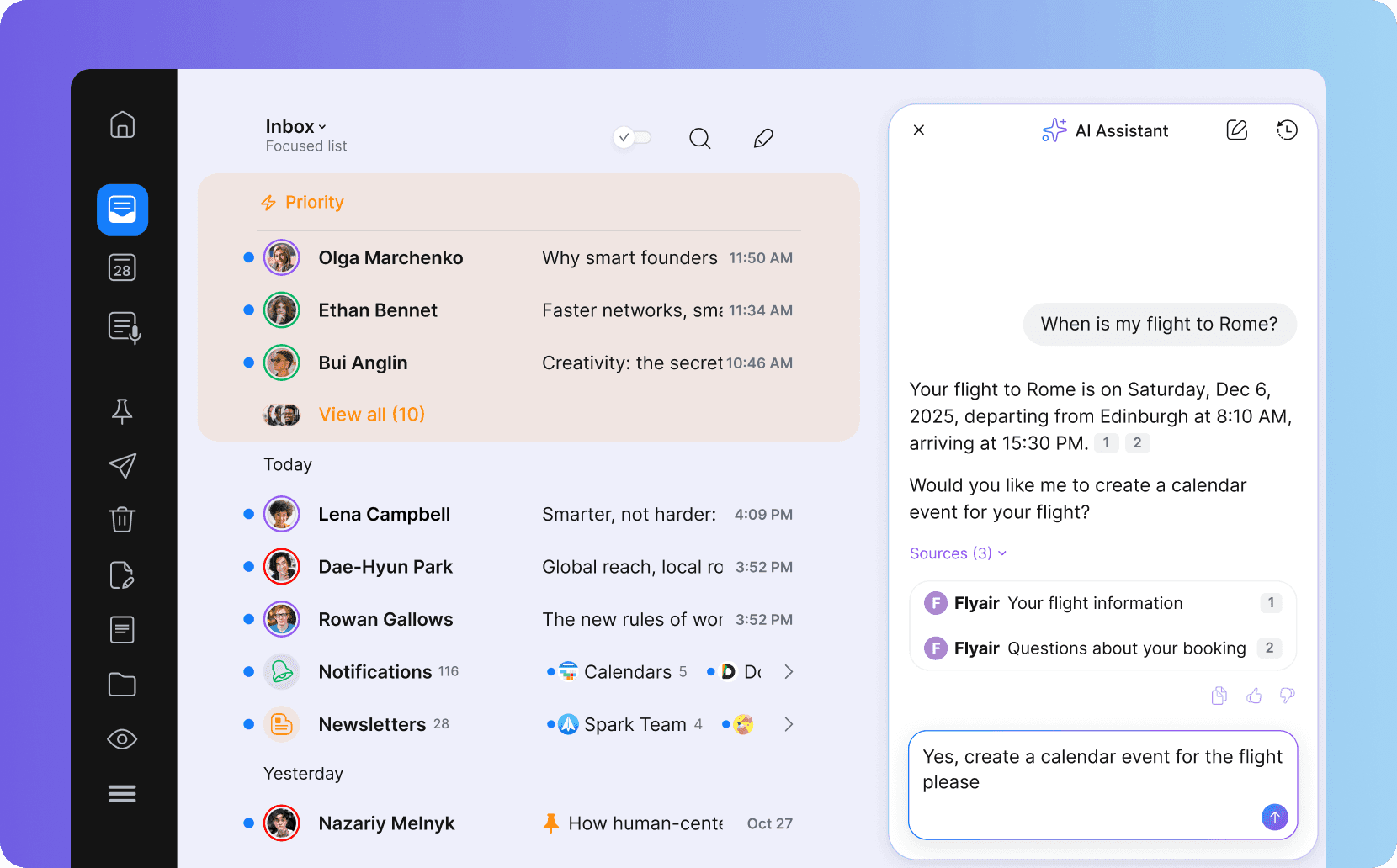
AI Composer: putting AI where people already write
People already knew where they wrote emails, so why make them leave that flow to use AI? The chat-panel prototype proved the point: every draft started with explaining the context and ended with copy and paste. +AI Composer moved into the compose and reply flow instead. The harder call was context. Replies needed the whole conversation, not just the last message, because an earlier decision in a thread can change the right answer entirely. The loop became Read → Reply → AI → Edit → Send, instead of Read → Open AI → Explain → Generate → Copy → Return.
Deep dive: drafts people actually send
Constraint: In the +AI Composer beta, drafts were fluent but generic. Most were rewritten or deleted before sending, and "doesn't sound like me" was the most common piece of feedback.
Options: We explored three fixes. Tone presets (formal, friendly, concise) were quick to build but still sounded like nobody in particular. A style slider gave control, but asked people to describe their own voice, which few can do. The third option was to learn the style from each user's own sent mail.
Test: We gave presets to one beta group and learned style to another for four weeks, and tracked one number: how often a generated draft was sent with light edits or none.
Evidence: Drafts in the user's own voice were sent at 2.3× the rate of preset drafts, and edits before sending got shorter.
Decision: My Writing Style became part of generation itself, with no setting to manage. The trade-off was privacy, so the style is learned only from the user's own sent mail, and onboarding says exactly that. Presets stayed as a fallback for new accounts with too little mail to learn from.
AI email templates
AI email templates matter most for a team's predictable, low-judgment sends — contract follow-ups, signature chasing, kickoff confirmations — where the variable isn't wording, it's data.
Meeting Notes with AI
Rule three: when a wrong answer costs more than a bad draft, ship it as a preview. Meeting Notes turns a call into structured, email-ready context through Spark's calendar integration. But an imperfect draft gets edited before it sends, while an incorrect summary becomes a false record of what was agreed. So Meeting Notes shipped as an early preview to Team subscribers, with every summary marked as AI-generated and linked back to the source notes, to prove that higher bar before a wider release.
Design system: one language, five platforms
We inherited five products that shared a brand, not a system — iOS, iPadOS, Android, macOS, and Windows had each accumulated their own version of the same component, subtly out of sync. I proposed rebuilding it around shared design tokens instead of five separate component libraries, letting each platform express the same decisions through its own conventions — SF Symbols and Apple patterns on iOS and macOS, Material patterns on Android. One system, expressed differently per platform, instead of five separate interpretations of the same component.
Composing a reply and to expanding in My Writing Style
What changed
Spark 3.0 was the biggest release in the product's history. 68% of Premium users tried +AI Composer within 60 days, and 71% of them used it again within the same week. After My Writing Style shipped in February 2024, drafts in the user's own voice were sent at 2.3× the rate of preset drafts. Meeting Notes stayed an early preview for Team subscribers while it proved its higher trust bar. And the design system rebuild cut cross-platform design inconsistency bugs by 62% year over year, while design-to-ship time for new features dropped from about eight weeks to five.
What Spark taught me
Working on Spark taught me that adding AI to a mature product is a design problem before it's a model problem. The real decisions weren't about how many AI features to ship — they were about where AI earned the right to exist: Composer belongs inside the writing workflow, Writing Style belongs inside generation, Assistant can be its own destination because its job is broader, and Meeting Notes needs a higher bar for trust. The design system had to make all of it feel like one product across five platforms.
The goal was never to make Spark feel more like AI — it was to make AI feel more like Spark.
If you'd like to talk about product design at scale, AI-native interfaces, or cross-platform design systems, I'd love to hear from you.