


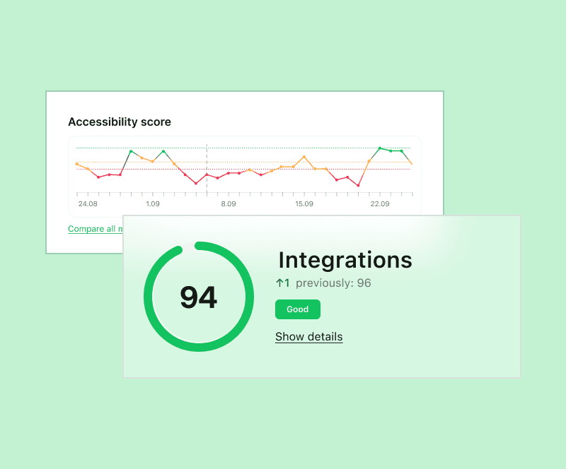


Where Developers Got Stuck
Alokai Console is where developers and ops teams manage storefront infrastructure, deployments and performance. It worked, but it fought them: the pages they visited most sat three menus deep, metrics showed one chart at a time, and nothing about it said Alokai.
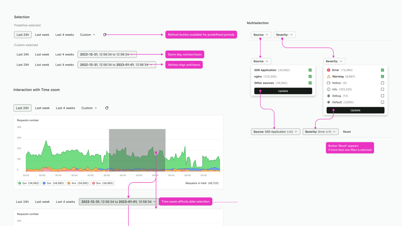
Across ~300 Hotjar recordings, the same loop kept repeating: scroll up, scroll down, switch the metric selector, scroll again. One developer in the internal survey summed it up: “I use the Console like a filing cabinet. I know where everything is, I just hate opening the drawers.”
Working with Alokai's product team, I combined the Hotjar recordings with an internal survey (15 of 47 responded), the Engineering Support backlog, card sorting and a benchmark of competing dev tools. From there I prototyped in Figma and A/B tested navigation and dashboard layouts, comparing the variants in Hotjar recordings and heatmaps before handoff.


Blog UI Makeover
The blog got a visual refresh, not a rethink. A clean multi-column grid, more white space and tighter typography made articles easier to scan, and every post got a custom graphic in Alokai's style, so the page finally looked like the brand behind it. Categories, tags and search stayed, restyled to match.
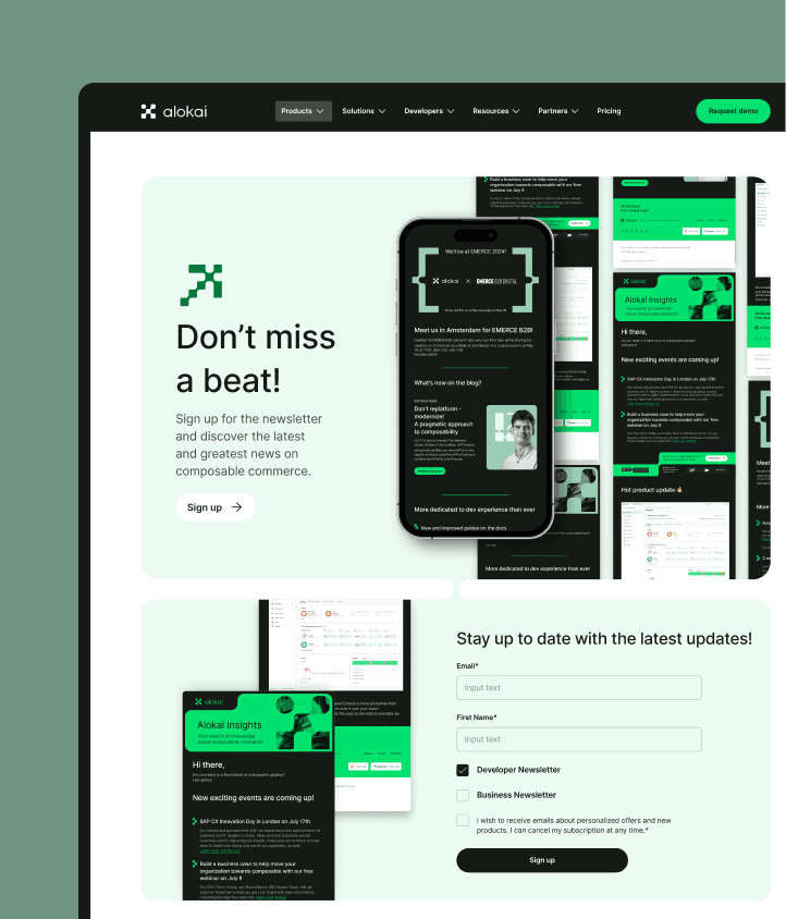


On mobile, the grid collapses to a single column, type scales with screen width, and article graphics are optimized to load fast without losing detail.


